O SAKS
BRANDING

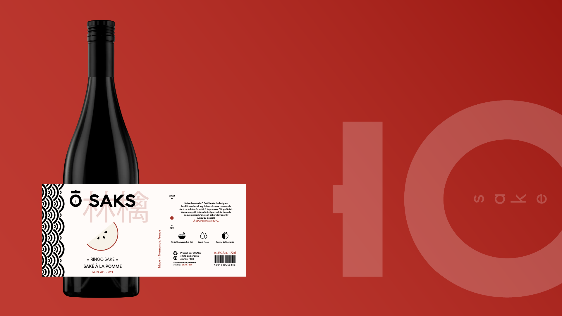
With a new product, apple sake, O SAKS is a brand that combines Japanese and Normandy traditions.


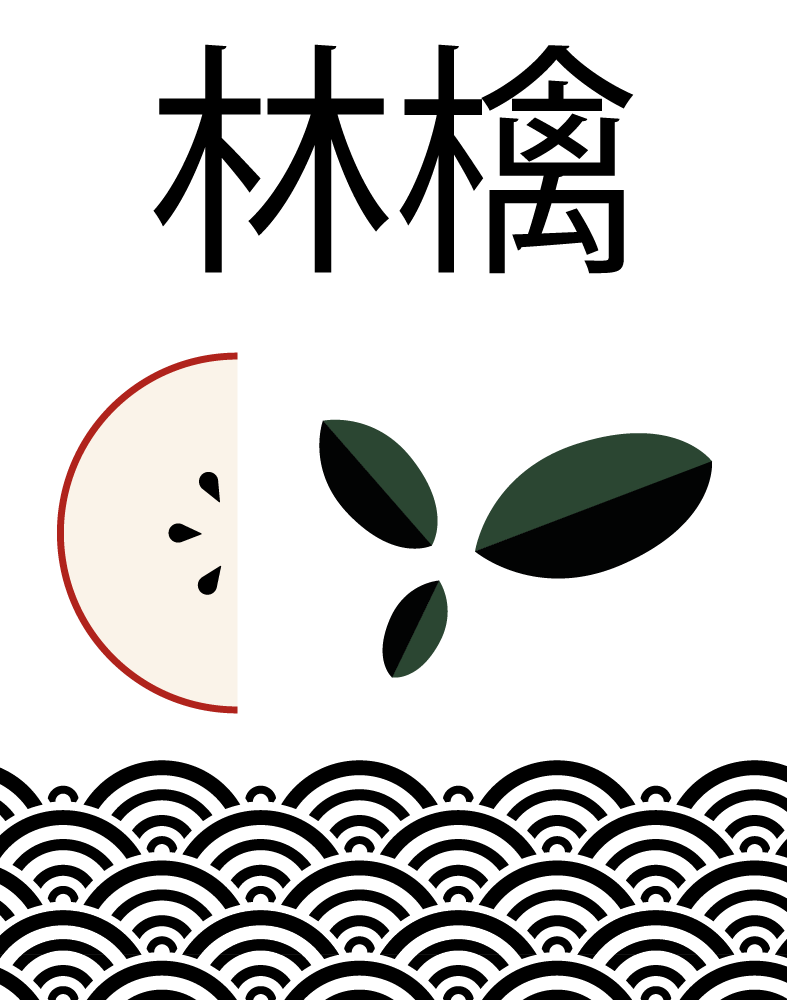
In terms of colour, red refers to the Japanese flag and apples. Black and cream are complementary, minimalist colours that refer to Japanese calligraphy. Finally, green is added as a touch to emphasise the natural aspect of the product.
Modern typography and various graphic elements that refer to both cultures are added.


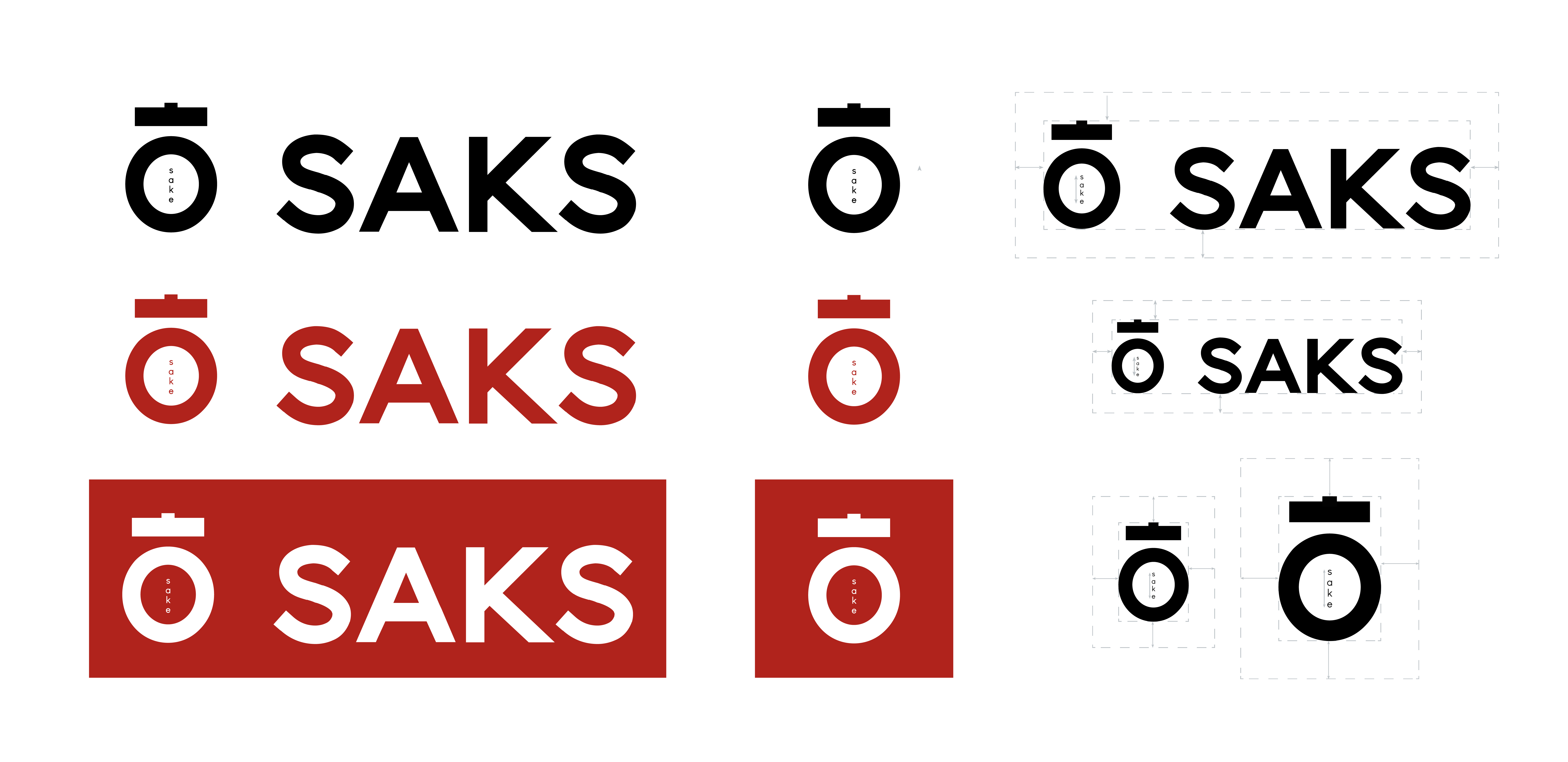
Typographic logo available in 3 colours.
The subtlety of the "O" differentiates the brand and can be used as a stand-alone symbol.
The "O" is placed under a bar, a sign of respect in Japan. The combination forms a komodaru (the barrel used to store sake), and the word sake is written inside the "O" to translate that it is inside.

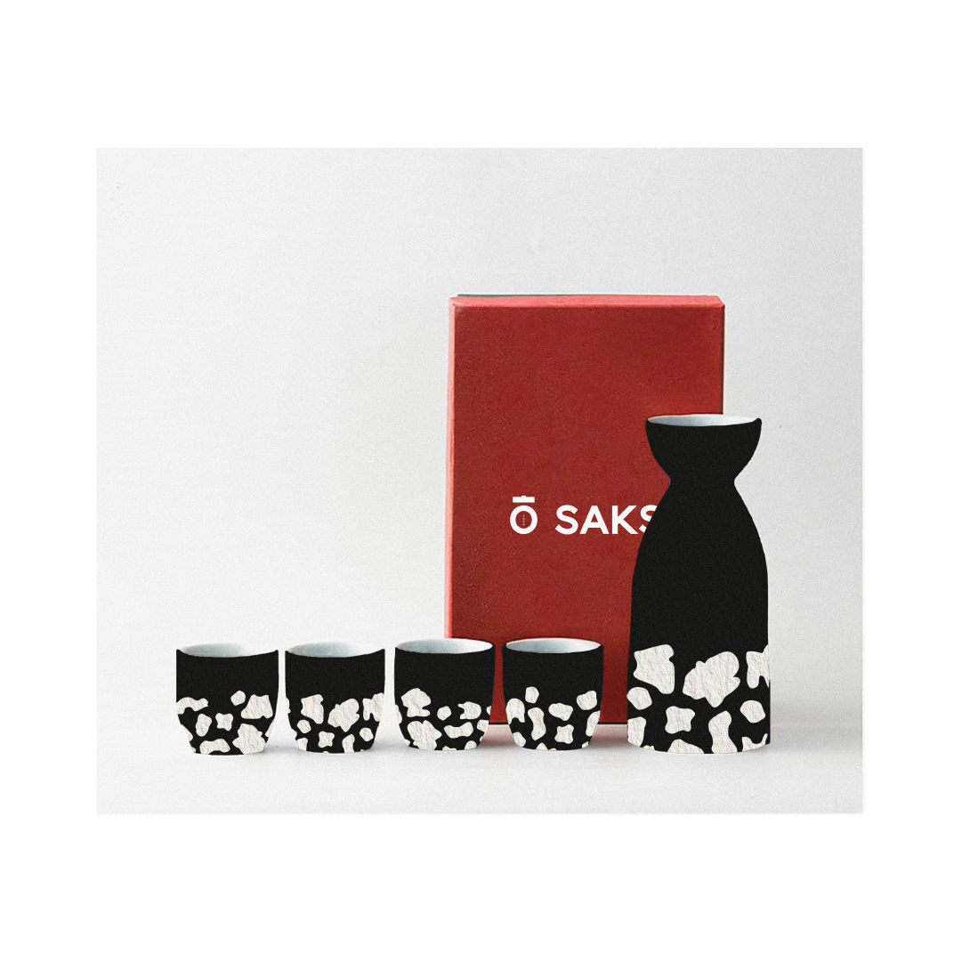
O SAKS, it's not just sake: the bottle can be combined with a shuki set with a beautiful cow pattern.
There is also a book with recipes for the best "food & sake" combinations for aperitifs, dinner and dessert.

2022 / ISCOM


